Joelmacool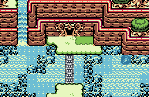
Twilight-Prince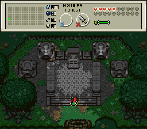
Monsira Forest was full of richness and beauty as Sona traversed through it. However, as Sona took a different direction there, she came upon what seemed to be an ancient altar of some sort. Though worn over time, a stone slab had legible words etched into it. It read as follows: "Four Sources of Dark, One Source of Light, Bring them upon here, Your goal shall come in sight.".
Sephiroth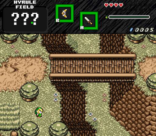
Link finds his way to the field and wonders whats below the bridge...
DragonDePlatino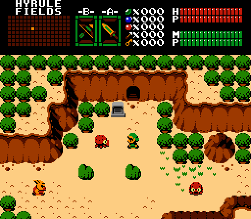
Heavily plagarizes inspired by the works of Niklas Jansson.
Feenicks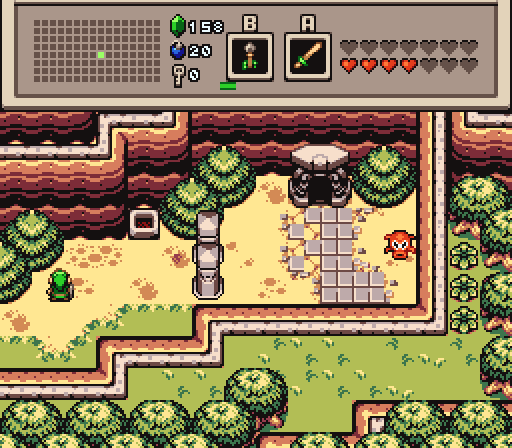
What's inside that dungeon? [spoiler: the white sword]

Screenshot of the Week 556
Started by
The Satellite
, Apr 24 2016 09:27 PM
DragonDePlatino Joelmacool Twilight-Prince Sephiroth Feenicks
-
 This topic is locked
13 replies to this topic
#1

The Satellite
-

- Members
-

May the way of the Hero lead to the Triforce.
- Real Name:Michael
- Pronouns:He / Him
Posted 24 April 2016 - 09:27 PM
- Joelmacool likes this
#2
DragonDePlatino
-

- Members
-

Pixel Dragon
Posted 24 April 2016 - 10:03 PM
A very strong showing by everyone! This week my vote went to Feenicks.
Joelmacool: I love your choice of colors here! The minty greens and bright blue reinforce the water theme really well. I feel you might've used too many different water tiles but the screen is really well-balanced overall.
Twilight-Prince: Hmm...This screen is pretty good but the layout keeps it from being a great screen. It's very slightly asymmetrical so my eyes keep gravitating towards details like the trees and stump. Fix those details, brighten up the palette and you could have a memorable landmark on your hands. 
Sephiroth: You've got the base of a good screen here but it's just screaming for some enemies or water or more colors or something! If you lowered the cliffs, shortened the bridge and gave yourself more room to the left, I think you could do a lot with this layout.
DragonDePlatino: its bad
Feenicks: I have a personal bias soft spot for Firebird so this one took my vote.  For such a simple perspective, there's a lot of depth to the screen. It's immediately apparent what you have to do and there's juuust enough playable space to make this feel cozy. Nice job!
#3
Alestance
-

- Members
-
Saint Alestance - Eliminator of the ZGP format
- Real Name:Lonk
- Location:Pennsylvania
Posted 24 April 2016 - 10:09 PM
I voted for DragonDePlatino's shot. Refreshing new graphic set is always welcome.
- Cukeman likes this
#4
Feenicks
-

- Members
-

still the harpy guy
- Real Name:Robert
- Location:dn ǝpᴉs ʇɥƃᴉɹ
Posted 24 April 2016 - 11:50 PM
Joelmacool: Decent dungeon entrance. Not sure I can get behind blocking off so much of the river, but I guess there's a reason for it in the overall layout of the area.
Twilight-Prince: Even if it is an altar, the screen as a whole feels a bit too symmetrical, especially for something that's apparently been undisturbed in the middle of a forest for so long.
Sephiroth: Good old DoR. Getting a nice highlands feel from the shot there, even if there's not really all that much going on in it. Can't really say I ever really felt those small trees blended in well with the rest of the stuff there, but that's an issue for another time.
DragonDePlatino: Man I'm really liking that tileset you have there. Gonna have to say the screen layout could be a bit more interesting but this would still have got my vote had I not entered.
Feen: Here's to hoping my perennial 'never finish anything beyond the first half of Level 2' syndrome doesn't manifest itself in this project.
#5
Cukeman
-

- Banned
-

"Tra la la, look for Sahasrahla. ... ... ..."
- Location:Hyrule/USA
Posted 25 April 2016 - 01:09 AM
Joel- It's good, but I'm used to fantastic from you.
Twilight- I love the atmosphere of this scene. The symmetry doesn't bother me because the focus is clear and there's only a few objects on the screen anyway.
Seph- Feels like it's missing something.
Dragon- I LOVE those mountains and trees, they imply a lot of detail and perspective without using very many colors- impressive! I also dig the toon style. The rocks still feel like a front-side perspective instead of being able to see some of the top, and it's really hard to make out the items in the button slots. Still this took me by surprise, overall it's fantastic! Voted.
Feenicks- I feel this could use a little more work, the right edge and bottom left edge feel very straight. Maybe it could use a little more space in front of the dungeon entrance? Why does that paved path lead straight into a mountain wall?
All the shots were good to fantastic. Great turnout!
Edited by Cukeman, 25 April 2016 - 01:10 AM.
- Twilight-Prince likes this
#6
Shane
-

- Moderators
-

💙
- Pronouns:He / Him
- Location:South Australia
Posted 25 April 2016 - 02:06 AM
I voted Sephiroth since he had the best and most interesting screen layout. Every shot was good however, so good job!
#7
Naru
-

- Members
-

Magus
Posted 25 April 2016 - 03:24 AM
Joalmacool - I have seen so many outstanding screens in that tileset lately (including yours of course), but this one is nothing special.
Twilight Prince - I don't get why everyone is so bothered about symmetry lately, I like your screen. The red-haired princess does not fit into the tileset for me though.
Feenicks - looks good to me, but not more.
Sephirot - looks solid, I get what Shane means, but I don't really like it.
Dragondeplatino - beautiful tileset, looks a bit like stickers and I have to remember paper mario by looking at it. The earth-walls break this up a bit.
#8
MermaidCim
-

- Members
-

Yes I'm that guy who dreamt Dani was Zelda. LOL Cimfam/zelda
- Real Name:Michael
- Location:Danbury, CT
Posted 25 April 2016 - 07:41 AM
DragonDePlatino
OK this screen I'm like so jealous of. This has that retro feel that reminds me of when the original Zelda game came out. For me there is no argument. This screen wins it for me. Whatever quest this is for, I want to play it immediately. [or is it released yet?]
NOTES:The subscreen is beautiful done, it's something I've never seen anything like before.
Edited by MermaidCim, 25 April 2016 - 07:42 AM.
- DragonDePlatino and Naru like this
#9
Eddy
-

- Moderators
-
ringle
- Real Name:Edward
- Pronouns:He / Him
- Location:London, United Kingdom
Posted 25 April 2016 - 08:13 AM
Joelmacool - Another really great shot. Love the colours in this one and the layout is nicely done.
Twilight-Prince - Not bad at all. The forest brush near the top could be made a bit less straight, but other than that, it's pretty good.
Sephiroth - Nicely done, it's completely beyond me to be able to use mountains like that lol. Either way, nice screen, I like it.
DragonDePlatino - Yes please. This looks really awesome and very unique too. The screen itself could've been a bit more interesting, but them graphics are 2good4me.
Feenicks - Another sweet Firebird shot. Maybe a bit more grass or bushes at the bottom of the screen would look good, but other than that, I really like what I'm seeing.
I voted for DDP this week. Good job to all!
- MermaidCim likes this
#10
Mibbitable
-
- Members
-

Junior
Posted 26 April 2016 - 02:47 PM
DragonDePlatino won my vote. I need this tileset in my life. Lol
- MermaidCim likes this
#11
Anthus
-

- Members
-
Lord of Liquids
- Location:Ohio
Posted 26 April 2016 - 05:38 PM
Voted for DragonDePlatino this week! Nice job, and it reminds me of Minish Cap, for some reason.
- MermaidCim and Cukeman like this
#12
Nathaniel
-

- Members
-
Deified
Posted 27 April 2016 - 12:44 PM
A long thought out decision, but I went with Feenicks. Nice graphics/design combo.
#13
trudatman
-

- Members
-

one point nine hero
- Real Name:that guy
- Location:State Of Love And Trust, The United State Of Amorica.
Posted 27 April 2016 - 11:02 PM
rough week. these have been great contests lately, but this time I struggled to choose one I sort of like. Feenicks.
#14
The Satellite
-
- Members
-
May the way of the Hero lead to the Triforce.
- Real Name:Michael
- Pronouns:He / Him
Posted 01 May 2016 - 10:16 PM
With 48.28% of the vote, the winner of Screenshot of the Week 556 is DragonDePlatino!
Congratulations!
Voting totals:
- Joelmacool (9 votes [15.52%])
- Twilight-Prince (8 votes [13.79%])
- Sephiroth (4 votes [6.90%])
- DragonDePlatino (28 votes [48.28%])
- Feenicks (9 votes [15.52%])
Also tagged with one or more of these keywords: DragonDePlatino, Joelmacool, Twilight-Prince, Sephiroth, Feenicks


1 user(s) are reading this topic
0 members, 1 guests, 0 anonymous users

